The 2-Year vs 10-Year Yield Spread: What the Curve Says About Sentiment
The yield curve is one of the most closely watched indicators in financial markets because it reflects how investors view economic growth, inflation and future interest-rate expectations. By comparing short-term and long-term Treasury yields, traders can gain insight into whether markets are becoming more optimistic or more cautious about the economic outlook. One of the most widely followed measures is the spread between the US 2-year and 10-year Treasury yields, often referred to as the 10Y-2Y spread.
Why the Curve Matters
Government bond yields are one of the clearest ways to see how investors are thinking about the economy and future monetary policy.
In practice, traders usually treat the US 2-year Treasury yield as the more policy-sensitive part of the curve because shorter maturities react quickly to changes in expected Federal Reserve interest rates. The 10-year yield, by contrast, is more often viewed as a blend of longer-term growth, inflation and term-premium expectations.
The gap between the two, known as the 10Y-2Y spread, therefore acts as a useful shorthand for whether markets are leaning towards confidence or caution.
When the spread is positive, the curve is steeper, implying healthier longer-term growth prospects. When it drops below zero, the curve is inverted, signalling tight near-term monetary policy. While an inversion has historically been viewed as an economic warning sign, recent experience has shown that it is not a perfect recession timer.
Current Yield Curve Snapshot
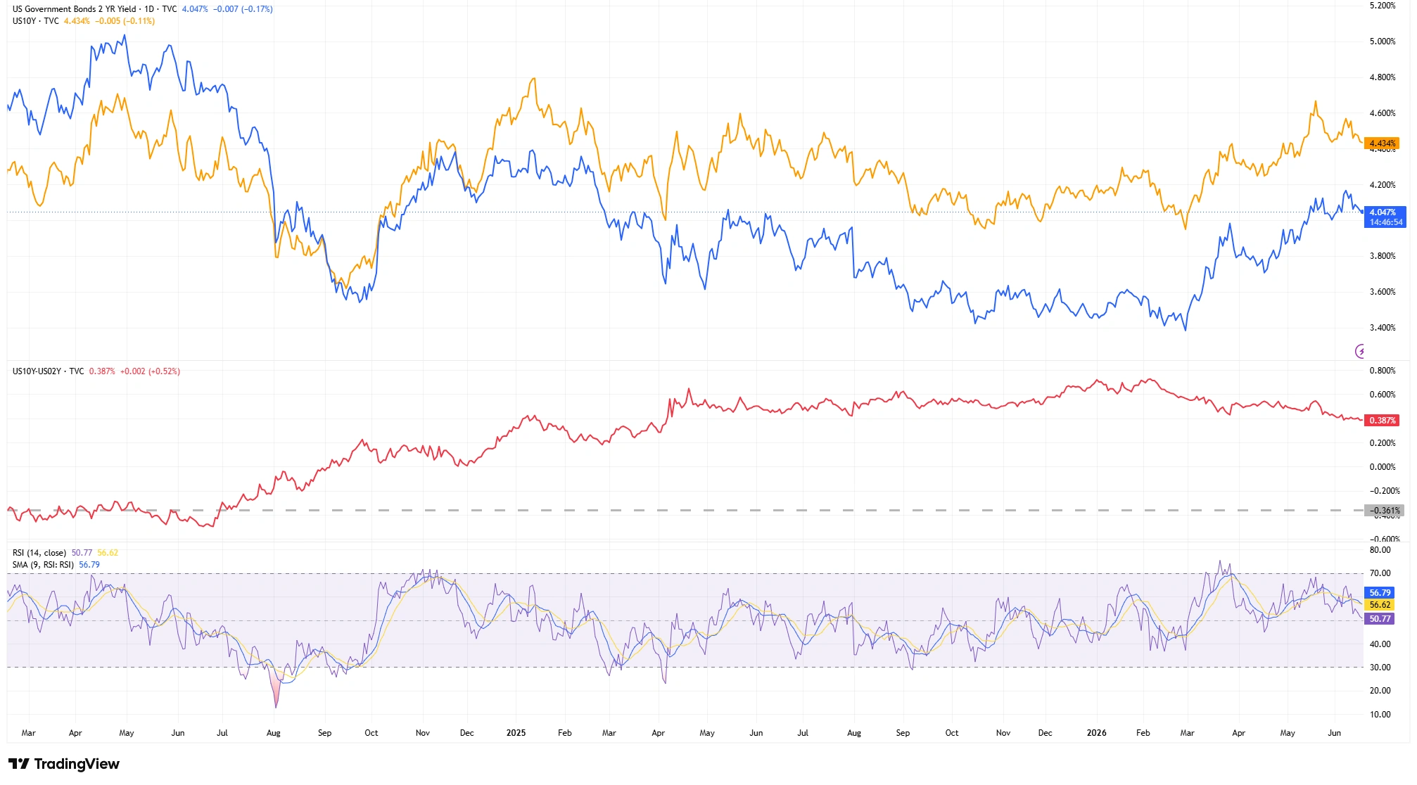
The latest market data show the US 2-year Treasury yield trading near 4.05%, while the 10-year yield stands around 4.43%. This leaves the 10Y-2Y spread at approximately 0.38 percentage points, or 38 basis points.
Earlier in June, the spread had been closer to 0.42 percentage points, meaning the curve has flattened slightly in recent weeks rather than continuing to steepen aggressively.
Although the curve remains positively sloped, the recent narrowing suggests that optimism about longer-term growth has moderated somewhat.
US Treasury Yield Map (Mid-June 2026)
- US 10-Year Yield: 4.43%
- US 2-Year Yield: 4.05%
- Current 10Y-2Y Spread: 0.38% (38 basis points)
Reading the Chart
The broader picture is more revealing than a few daily fluctuations.
During early 2024, the yield curve remained inverted, with the spread trading below zero as short-term yields exceeded long-term yields. Over the course of late 2024, the spread gradually recovered and eventually moved back into positive territory around October 2024.
Through 2025, the curve continued to normalise, with the spread consolidating mostly between 0.20 and 0.30 percentage points for much of the year. The steepening phase became more pronounced toward late 2025 and into early 2026, when the spread expanded into the 0.45 to 0.60 percentage point region.
The current reading of approximately 0.38 percentage points shows that the curve remains positively sloped. The inversion phase has ended, but the recovery has become more balanced rather than continuing to accelerate.
An important observation for traders is that turning points in the yield curve can sometimes appear before similar shifts become obvious in equities, currencies or commodities. This is one reason why bond markets are often closely monitored for early signals about changes in sentiment.
US Treasury Yield Curve and 10Y-2Y Spread
Source: TradingView. Past performance is not a reliable indicator of future performance. Data as of 17 June 2026.
Daily three-panel chart showing the US 2-year Treasury yield (blue line) and US 10-year Treasury yield (orange line) in the upper panel. The middle panel displays the 10Y-2Y yield spread (red line), highlighting the transition from inversion during 2024 to positive territory around October 2024, followed by a period of normalisation throughout 2025 and a steeper phase into early 2026. The lower panel shows the 14-period Relative Strength Index (RSI) together with its moving average.
How Traders Combine the Spread with Technical Structure
On a clean daily chart, traders can quickly see whether both yields are rising together, falling together or diverging.
Compared with mid-2025, both yields remain slightly higher, but the spread itself has become somewhat flatter.
Because of this, traders often focus less on absolute yield levels and more on whether the spread is forming higher lows, holding support or beginning to move back toward flat territory.
Trend direction and momentum therefore matter just as much as the level of yields themselves.
Momentum and Market Psychology
Momentum indicators such as the Relative Strength Index can provide additional context, although they are generally used as confirmation tools rather than standalone signals.
Recent RSI readings have eased to around 51.1, while the signal line remains near 56.6. This moderation in momentum is consistent with the recent narrowing in the spread from around 0.42 percentage points earlier in June to approximately 0.38.
In other words, the steepening trend remains intact, but the pace of the move has cooled rather than accelerated.
Psychologically, a steeper curve is often associated with stronger confidence in future economic activity and a healthier risk environment. A flat or inverted curve, by contrast, tends to reflect concerns surrounding restrictive monetary policy and slower growth prospects.
Recent history also serves as a reminder that the yield curve should not be viewed as a mechanical recession indicator. Although the inversion that persisted through early 2024 attracted considerable attention, the US economy proved more resilient than many investors initially expected.
Bottom Line
The 10Y-2Y spread remains positive, indicating a healthier backdrop than the inversion period that dominated much of 2024.
However, recent price action suggests the pace of steepening has slowed, pointing to a more balanced outlook rather than an aggressively improving growth environment.
For traders, the yield curve is often most valuable when viewed as part of a broader framework that includes price structure, momentum and macroeconomic context. Together, these tools can provide a clearer picture of the sentiment shaping financial markets beneath the surface.