
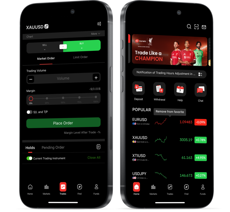


How to Read Forex Charts
Learning how to read forex charts is a skill that is refined over time. Most beginners will not become comfortable analysing any price chart overnight, but there are main starting points to build fundamental knowledge. This article will cover the basics of how to read forex charts including the axes, analysing price movements, types of trading charts and support & resistance levels. Reading the market can be technical, so the best way to tackle this is to learn how trading charts work step by step from the ground up.
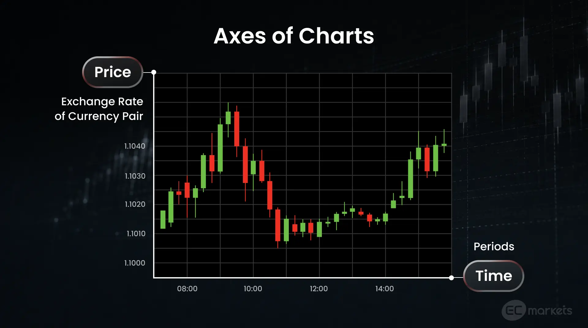
The Axes of Forex Charts
The basics of understanding how to read forex charts start with having a clear idea of the two axes that they are built on: price and time.
- Price is the vertical axis, which displays the exchange rate of a currency pair. For example, the numbers running along the vertical axis of the EUR/USD chart would represent the value of the euro in US dollars.
- Time is the horizontal axis, which represents the periods that the price is plotted against. Trading charts can be set to various periods, often called ‘timeframes’, such as one minute, one hour and one day. For example, a chart with one-hour periods on the horizontal axis will show prices by the hour.
Choosing the best timeframe comes down to trading styles. For example, a short-term trader or scalper needs the most frequently updated information, which means viewing charts with shorter timeframes, such as one-minute or five-minute charts, while a swing trader would typically be better served viewing daily or weekly trading charts.
Another thing that traders must be aware of is that, by default, most trading platforms use the broker’s server time rather than the trader’s local time. That is why traders who track economic announcements and other news releases need to be aware of which time zone their platform is using on their trading charts to accurately anticipate the effects on the market.
Analysing Price Movements on Forex Charts
Interpreting price movements is the main goal when understanding how to read forex charts. The first step is knowing how to read the exchange rate of a currency pair. Let’s use EUR/USD as an example. All currency pairs are written as ‘Base Currency / Quote Currency’, so in this case, EUR is the base and USD is the quote. If the EUR/USD exchange rate reads 1.1700, that means one euro is worth 1.17 US dollars. If the rate increases to 1.2000, it means the euro has strengthened against the dollar. The opposite is true if the exchange rate were to decrease.
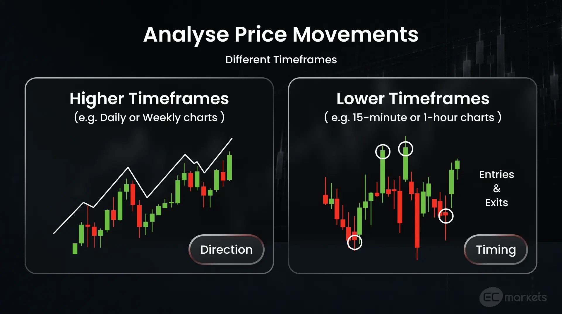
The next step is to analyse price movements across different timeframes, because focusing on a single timeframe does not provide the full picture. Traders should look at prices over both higher timeframes (e.g. daily or weekly charts) and lower timeframes (e.g. 15-minute or one-hour charts). Price movements over a higher timeframe show the broad direction of a currency pair, while lower timeframe charts are useful for timing entries and exits. A trader who only looks at short-term price movements will never be able to properly assess risk and will essentially be playing a guessing game.
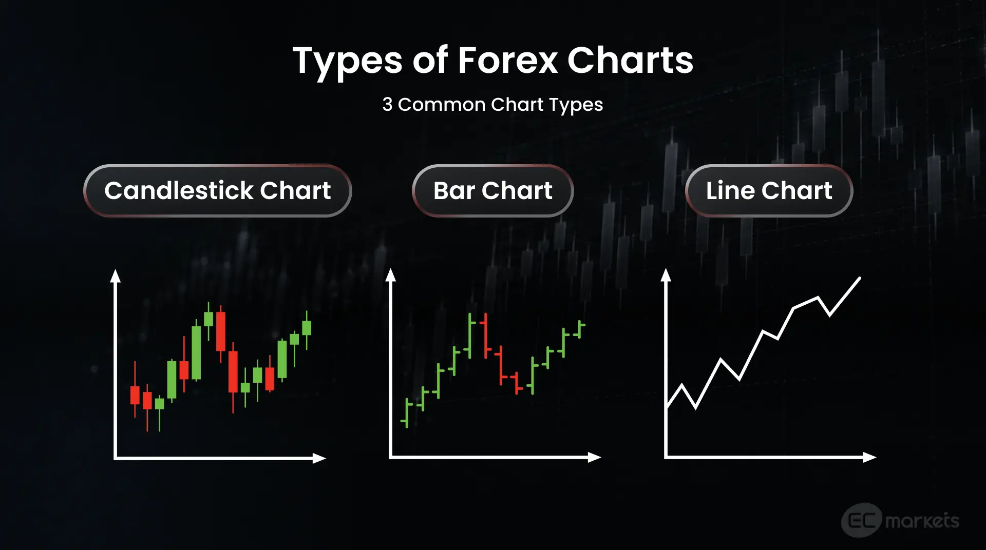
Main Types of Forex Charts
Price charts in forex trading are the core tool used to show how the exchange rate of a currency pair has changed over time. Knowing how to read forex charts enables traders to identify trends and key price levels in the forex market, which would otherwise be difficult to do just by looking at numbers alone. There are three main types of trading charts:
- Candlestick charts are the most widely used by traders. They are information dense, with each individual candle indicating the open, high, low and close prices (OHLC) reached within a single period. The body of the candle (the rectangular part) shows the distance between open and close. A green body typically indicates that the price closed higher than the opening price, while a red body usually indicates that the price closed lower than the opening price. The wicks (the lines) on either end of the body indicate the highest and lowest price of the period. This visualisation of data enables traders to analyse direction, range and momentum at the same time, which makes candlestick charts a popular format in forex trading.
- Bar charts are a different visual representation of the same OHLC price data shown in candlestick charts. Each ‘bar’ is simply a vertical line with the upper end indicating the high and the lower end indicating the low. Bars also have small horizontal ticks: the tick on the left represents the opening price and the tick on the right indicates the closing price. Bar charts are not typically colour-coded by default. Direction can be determined by the positioning of the horizontal ticks: if the right tick sits lower than the left, then the price has gone up, and vice versa.
- Line charts are typically used to understand the bigger picture, such as seeing a currency pair’s long-term trend. They enable traders to get a simple view of major highs and lows, and broad support and resistance levels without all the detail that comes with showing short-term fluctuations.
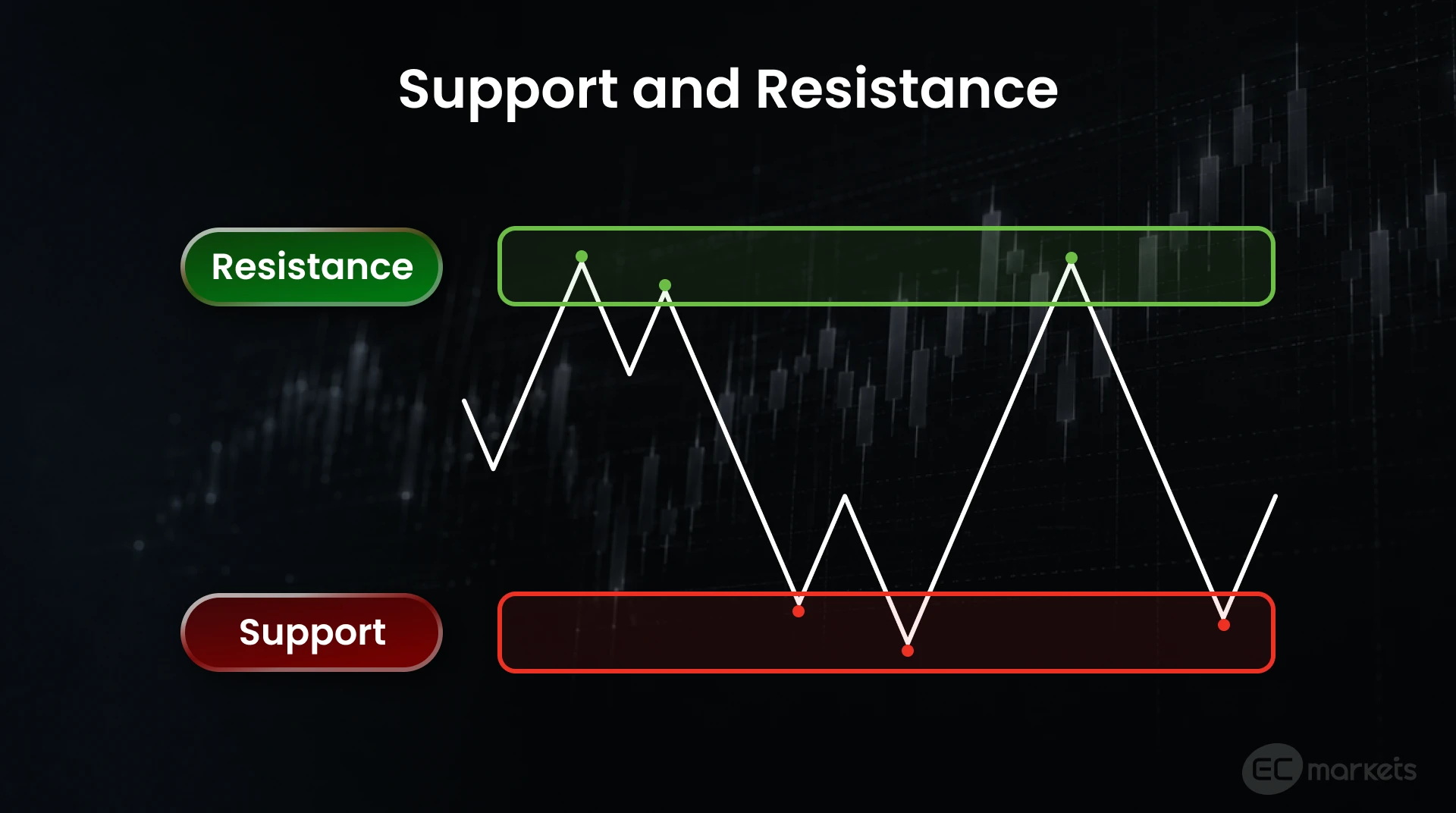
Support and Resistance Basics
Identifying support and resistance levels on a chart is an essential part of entering and exiting trades. But what are they?
Support can be thought of as a floor. It is the price level at which falling prices stop falling and reverse upwards. This happens because falling prices attract more buyers until they start to outnumber sellers – that is when prices begin to push back up.
Resistance is the opposite, and it can be thought of as a ceiling. It is the price level at which rising prices stop rising and reverse downwards. As prices rise, more traders look to sell and, eventually, sellers outnumber buyers, which causes the upward trend to lose momentum.
In practice, prices rarely reverse at exactly the same level on each occasion. Rather, prices usually breach a level or come close to it before turning around. This is why it is better to treat support and resistance as zones rather than exact prices.
Price can often break well past support or resistance. When this happens, it changes the dynamic of the market, whereby a price level that was resistance becomes a support level, or vice versa – this is called ‘role reversal’. A break in a resistance level indicates bullish momentum, and any pullback towards it is then seen by traders as a discount, turning it into a support level. The opposite is true when a support level is broken, signalling bearish momentum, so any subsequent pullback is seen as overpriced, turning the broken support into a resistance level. However, not all breaks lead to a true reversal. False breaks often occur, where price briefly pushes through before returning, which is why traders must be able to tell the difference between a false and a convincing break.
Conclusion | How to Read Forex Charts
Getting comfortable looking at forex charts and taking information away from them is when the classic 'practice makes perfect' saying becomes relevant. It is normal for beginners to look at a trading chart and be overwhelmed by all of the detail. That is why it is important to master the foundations of how to read forex charts first, including the axes, types of charts and key levels. From there, it becomes much easier to learn the more technical aspects of trading charts.