Nasdaq vs Dow Jones: How to Read the Market's Risk Appetite
While major US equity indices often move in the same overall direction, the types of stocks leading the market can shift noticeably over time. Traders watch these leadership changes closely because they often reveal how confident investors are about taking on risk.
The Nasdaq 100 is heavily weighted toward growth-oriented technology companies, which means it tends to perform best during stronger “risk-on” periods when investors are comfortable chasing momentum and higher-growth opportunities.
The Dow Jones Industrial Average, by contrast, contains more mature blue-chip companies across sectors such as industrials, healthcare, consumer goods, and finance. Because many of these businesses are viewed as more stable and less sensitive to swings in market sentiment, the Dow is often associated with more defensive positioning.
Comparing these two indices can therefore offer useful insight into whether capital is flowing toward aggressive growth sectors or rotating into more stable areas of the market.
Reading Relative Performance
One of the clearest ways traders analyse sector rotation is through relative performance. Rather than focusing only on whether markets are moving higher or lower, traders also look at which index is leading.
When the Nasdaq consistently outperforms the Dow, it usually reflects stronger appetite for growth stocks and higher-risk sectors. Technology leadership tends to appear when investors are optimistic about earnings growth, liquidity conditions, or broader economic momentum.
However, when the Dow begins to narrow the performance gap or outperform over shorter periods, the market tone can start to shift. That does not necessarily mean investors are turning bearish. More often, it suggests they are becoming slightly more selective with risk exposure and rotating toward companies perceived as more stable or defensive.
What the Chart Actually Shows
Looking at the chart, both the Dow Jones and Nasdaq 100 trended higher over the past month, but the Nasdaq clearly led the move. The Nasdaq gained roughly +16.9% during the period compared to around +6.1% for the Dow, creating a visibly wider performance gap between the two indices. This reflected stronger momentum within technology and growth-oriented sectors.
More recently, however, the pace of Nasdaq outperformance has started to flatten slightly. While the technology-heavy index continues to lead overall, the chart shows the performance spread stabilising toward the right-hand side rather than widening aggressively as it did earlier in the move.
This type of behaviour is important because it can suggest that aggressive growth momentum is beginning to cool slightly, even as the broader market trend remains positive.
Dow Jones vs Nasdaq 100 Relative Performance (Past Month)
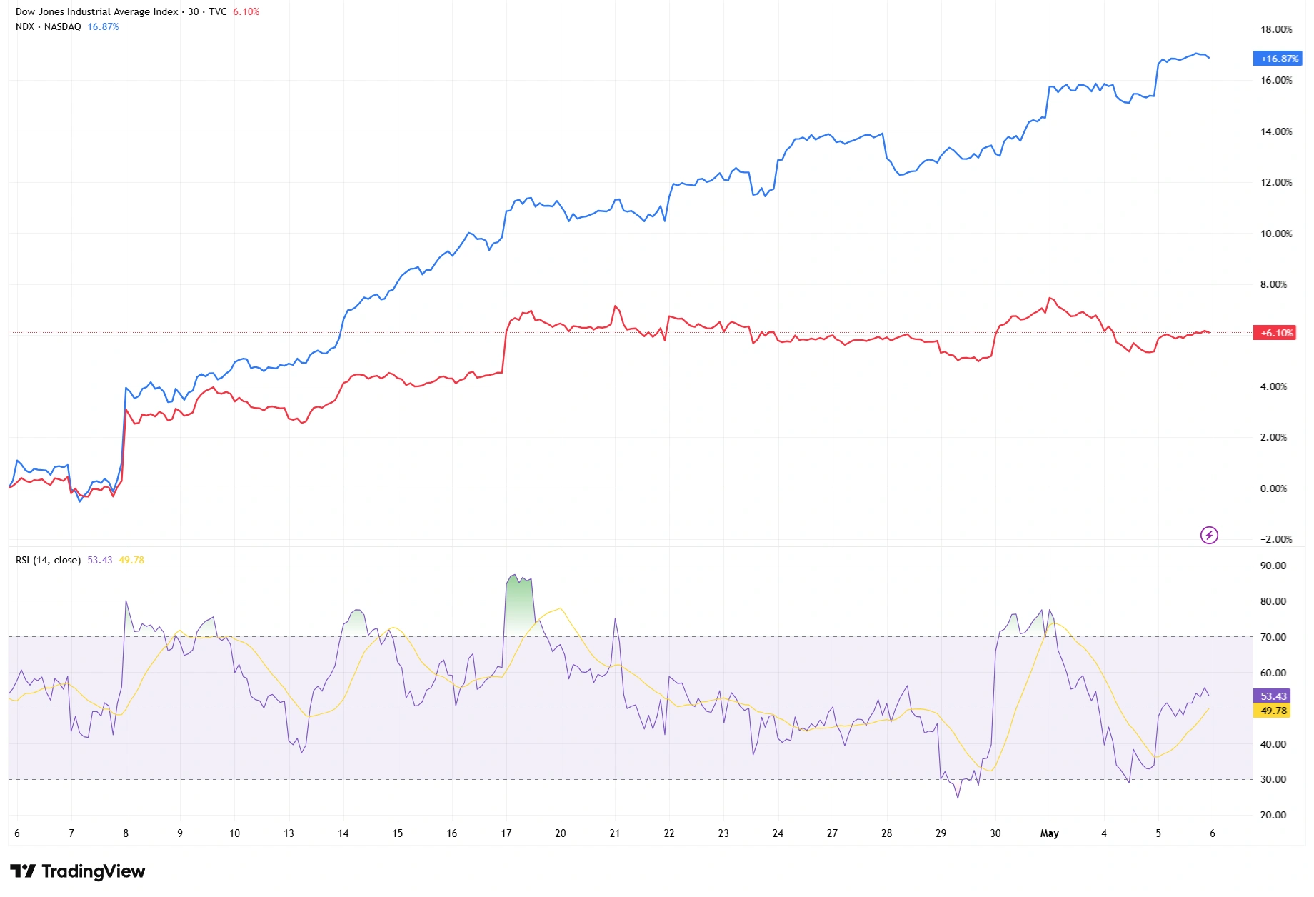
The Nasdaq 100 significantly outperformed the Dow Jones over the past month, although the pace of leadership has started to stabilise more recently as momentum cooled from earlier highs.
Market Structure and Momentum
Beyond relative performance itself, traders also monitor how leadership trends evolve over time. Markets rarely move in straight lines, so understanding whether momentum is accelerating, stabilising, or fading can provide additional context.
In this case, the Nasdaq’s earlier outperformance was much steeper during the middle phase of the chart, while more recent price action shows a flatter relative structure and slower momentum expansion. Meanwhile, the Dow has shown more resilience during shorter pullbacks.
Importantly, the Nasdaq has not broken down relative to the Dow. Leadership has simply become less aggressive rather than fully reversing.
What RSI May Be Suggesting
Momentum indicators such as the Relative Strength Index (RSI) can help support this type of analysis.
RSI measures the speed and strength of price movement, helping traders assess whether momentum is strengthening or cooling. On the current chart, RSI pushed into stronger momentum territory during the earlier phase of Nasdaq leadership before gradually easing back toward the middle range more recently. This mirrors the moderation now visible in the performance spread itself.
Importantly, this moderation in RSI does not automatically imply a reversal. Instead, it suggests that momentum may no longer be accelerating at the same pace as before. This aligns with the broader chart structure, where Nasdaq leadership remains intact but has become less dominant over recent sessions.
If RSI begins strengthening again alongside a widening performance gap, it could indicate renewed confidence in growth-oriented sectors. If momentum continues easing while the Dow narrows the spread further, it may reinforce the idea that investors are gradually rotating toward more defensive positioning.
The Bottom Line
Comparing the Dow Jones and Nasdaq offers traders a deeper way to interpret market behaviour beneath headline index moves. Even when both indices are trending in the same direction, changes in leadership can reveal important shifts in investor confidence, sector preference, and broader risk appetite.
Right now, technology stocks still appear to be leading overall, but the stabilising performance gap suggests investors may be becoming more balanced in their positioning beneath the surface
As always, relative performance analysis should be viewed as one tool among many. It does not predict market direction on its own, but it can provide valuable insight into how market sentiment is evolving across different parts of the market.