CPI vs PCE: Why Traders Care About Two Inflation Measures
Traders often scratch their heads when monthly inflation data arrive. One moment markets leap on the latest Consumer Price Index (CPI), the next analysts remind us that the Fed really watches the Personal Consumption Expenditures (PCE) index. Why do we have these two gauges, and why do markets treat them so differently?
The CPI is the measure in most headlines. Compiled by the Bureau of Labor Statistics (BLS), it tracks price changes for a fixed basket of goods and services bought by urban households. Simply put, CPI reflects what households pay out of pocket for things like rent, petrol, groceries or clothes. This makes CPI very visible. A big CPI surprise can spark immediate market moves.
By contrast, the PCE price index from the Bureau of Economic Analysis (BEA) takes a broader view. It includes not only what households pay directly but also spending made on their behalf. For example, health care paid by employers or government benefits. Its basket is larger and its weights re-adjust more frequently to capture substitutions. As a result, PCE readings tend to run a bit lower and smoother than CPI.
A key technical difference is how each index updates its “basket” of goods. The PCE uses a chain-weighted formula (Fisher Ideal) that adjusts when consumers switch to cheaper alternatives, whereas the CPI uses a more fixed basket (Laspeyres) that changes only slowly. In practice, this means PCE “accounts for substitution”. For example, if beef gets expensive and buyers buy more chicken instead, the PCE will reflect that switch but the CPI’s fixed basket will not. Over time this tends to make CPI inflation run slightly higher, since CPI doesn’t immediately count substitutions that dampen price pressures.
Why the Fed prefers PCE
The Fed officially switched to PCE around 2000 and now anchors its 2% inflation target to that measure. Policymakers favour PCE because it covers more of the economy (including some spending CPI misses) and its chain-weighting captures consumer substitutions. Analysts say PCE’s “dynamic weighting” and broader scope give a clearer picture of underlying inflation trends.
Why markets fixate on CPI
If the Fed is all about PCE, why do traders panic at CPI? Mostly it’s habit and timing. CPI is simply more visible; people fixate on the familiar CPI number. It also arrives about two weeks before the official PCE report, so in practice it often drives market moves.
Diverging stories and mixed signals
CPI and PCE can sometimes diverge. For example, CPI assigns heavy weight to housing, whereas PCE puts more weight on healthcare. This helped CPI run much hotter than PCE in 2022 – the biggest gap on record! TD Economics warns that such a disconnect “will complicate the ability of the Fed to definitively say that inflation has turned”.
Persistent divergence may influence Fed communication and market volatility in 2026.
CPI vs PCE Inflation Rate (YoY %)
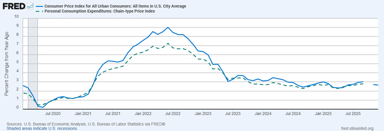
Sources: U.S. Bureau of Economic Analysis; U.S. Bureau of Labor Statistics via FRED®
The chart shows how CPI (solid line) has consistently run hotter than PCE (dashed line), especially during the 2022 inflation spike. This divergence reflects differences in weighting and methodology; a key reason why the Fed prefers PCE while markets often react to CPI.
Putting it in perspective
So what should traders do then? Rather than picking a side, use both measures together. Watch inflation trends over months. Central banks think in terms of persistence, not just one data point. Remember the Fed judges inflation by PCE, even if markets twitch at CPI. The key is context: focus on trends and how long price changes last, not just one headline.
Bottom Line: CPI and PCE each serve a purpose. The Fed leans on the broad, chain-weighted PCE index to gauge long-term inflation trends, while CPI’s familiar headline number “serves as a driver of sentiment.” Each metric has its role in the market ecosystem – understanding why they differ, instead of panicking at one data point, will help you navigate the next inflation report with confidence.
We’ve seen this play out in recent years. For example, during 2022 the US CPI inflation rate surged roughly 3.4% points above PCE – the largest gap on record. This was largely because housing rents and energy costs jumped sharply. Those categories carry heavy weight in CPI but less weight in PCE (especially since PCE includes many third-party and non-cash expenditures), so CPI spiked more. In short, when shelter and fuel prices climb fast, CPI moves more than PCE.
Practical takeaway: Don’t fixate on one headline measure. Always check which index is moving and why. If CPI is running hotter than PCE, it usually signals big jumps in things like housing or fuel; if PCE is higher, it suggests broader shifts in consumer spending (as recent analysts have noted for late‑2025). Remember that the Fed targets PCE inflation, even though markets often react to the CPI. In other words, look under the hood: compare both numbers and their components to know where inflation really is, and you’ll be better placed to interpret data surprises in trading.